As a blogger and photographer, one of my goals is consistency across my brand. That doesn’t mean that I don’t want to branch out and try new things, but I want people to look at my photographs and instantly recognize them by style and color. For example, I’m drawn to moody photos and darker colors, so I try to capture that in my photography. But I also recognize that these images can also read as sad, so I try to balance them with light and airy images as well.
In order to figure out where my color scheme lies, I entered my Instagram name {DaenelT} into the ColorKuler search bar and let it do its thing…
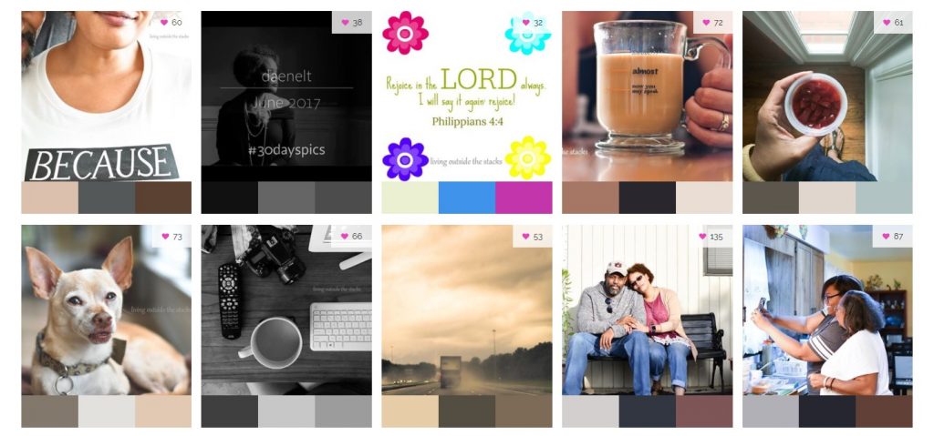
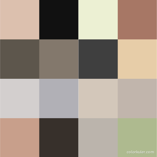
After analyzing the last 16 photos in my Instagram feed, ColorKuler determined that my color is Dimgray.
I can honestly say, I was surprised to find that my colors lean towards the grays, especially when it feels like most of my photos are dark and moody. This just goes to show that it sometimes helps to see your work through fresh eyes {even if those “eyes” are algorithms}. Overall, I’m happy with the results because I am a big fan of neutrals with pops of colors {as evidenced by the single image with the muted greens and bright blues and pinks}.
If you’re a blogger or business owner, this is a great tool to use for marketing consistency and setting a cohesive look for your brand. What do you see when you look at your photos? How about your blog {if you’re a blogger}? Do you think your view meshes with what others see?
Happy Snapping,